How To Create a Stylish Environment
Table of Contents
This How To will show you how to create a stylish 3D environment that can be used to create presentations with a unique look and feel. This is an advanced how to that presents a number of useful techniques, not a step by step guide to create the exact result as shown in the screenshots.
Introduction
The environment we are about to create is a very simple one. The viewer is placed inside a cylinder so that his view is limited in each direction. This gives him a perception of space and gets rid of the black, infinite nothingness of a blank scene. What is more important than the scene itself are the tweaks to achieve the polished result since in one way or the other they can be applied to almost any 3D environment.
Scene Setup
The general setup is rather simple. Create a Cylinder with a very large radius and a very large hole in it. This will create a thin, 360 degree "canvas". Add a Circle as a ground and a Camera that sits inside the cylinder.

Reflective Ground and Light Setup
The first tweak is to make the ground reflective using the technique shown in How To Add a Mirror Reflection. Also note that we use the same 3-light setup as described in the reflection how to to get rid of the plastic look which is usually created by the default headlight.

Textures
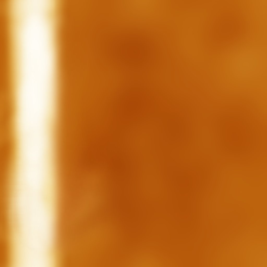
To make the cylinder more interesting, we add a stylish texture to it. You can use pretty much any image processing tool (Photoshop, Gimp, ...) available to create this texture. Create a new 1024x1024 image and fill it with a dark base color. Then use the dodge/burn tool with a soft and very large brush to increase the brightness of some areas. Here we have drawn a line on the left and some spots on the right. Optionally, use Gaussian blur to make the main area of the texture very smooth. There should be no detail in the texture except for the bright stripe.
To ensure the texture is repeatable, temporarily double the size of the canvas and create a 2x2 grid of the same texture (add copies of the texture to its right and bottom). Then crop a region that is equal to the target texture size from that 2x2 grid. This will ensure that the bottom of the final texture will match the top (and left will match right). Use the smudge tool to paint over the regions where the discontinuity of the initial texture is visible.

Apply this texture to the cylinder by dragging the Texture node from the Toolbox to the scene and choosing an Image Loader from the pop-up that appears. This will automatically create a 2D Mapping node as well. Change the RotationZ and the Scaling to create the nice bending lines effect shown in the screenshot below. At this point, you might want to head back to the image processing tool and modify any area that doesn't look right in 3D.
For extra effect, bind a Mover to the PositionY property of the mapping to slowly move the lines up and down. To avoid distracting the audience from the main content, use something like 200sec for a 0 to 1 and back animation.

Glow and Fade
One of the most impressive effects is making parts of a scene glow. While one might try to use the BlurTexture Glow Node for this, it often works better to simply fake the glow with a 2D texture. What we will use here is a simple linear gradient that uses pure white as a base color and then blends between 100% and 0% alpha.

We'll use the glow to hide the hard border between the ground and the wall. Make a copy of the main cylinder, reduce its height and position it where the ground and wall meet. Apply the gradient texture and use the mapping parameters to have 0% alpha at the top and 100% alpha at the bottom. Create another cylinder with the same texture but rotated so that the 0% alpha is now at the bottom. As an alternative, a single texture that goes from 0% to 100% to 0% could be used. Reduce the radius of the smaller cylinders slightly so that the glow is always in front of both the ground and the wall.

If the scene is presented on a large projector setup, it can help to add another gradient to the top of the scene using an Overlay Rectangle. The purposes of this is to blend the projection with whatever is above the canvas, usually a black frame of some sort. Having the scene fade out in this way will break the hard edge between projection and frame and thus increase the impression of depth.
Conclusion
As the final image shows, using just a few tweaks, the quality of a presentation can be improved tremendously. Rich textures are a great way to hide simplicity of the used geometry and glowing elements - if used tastefully - can make a scene look much more dynamic.